Migra app
ROLE
UX design
UI design
YEAR
2022
PRODUCT
Research
App
Client introduction
Migra is an app for migrants and refugees who have recently arrived in Spain. By storing their important documents and helping them connect with official organizations, we make their transition into this country as easy as possible for all people involved.
Objectives
The objective is to help migrants and refugees navigate the difficult process of settling in. This app helps them with having the right documents with them at all times, remembering their appointments, and helping them find the most necessary health-related organizations.
Design process
Empathize:
• Interviews
• Personas
Define:
• Empathy map
• Storyboard
• POV statements
• Competitor Analysis
Ideate:
• Brainstorm - Crazy 8's
• User flows
Prototype:
• Learning canvas
• Wireframes
Test:
• Qualitative user testing
Problem statement
How can we help migrants and refugees navigate the health care system during their first months after arrival?
Interviews
While it wasn't easy to interview the correct people, we were quite pleased with the amount of information they were able to give. This information I wouldn't otherwise find through other sources (internet, books, articles, etc.)
Difficulties were: being granted access to the camps, and being given permission to talk to these vulnerable groups of people.
The interviewees were migrants, refugees, and healthcare workers at the Red Cross refugee camp. Ideally, I would have liked to include illegal immigrants, and learn more about their situation after leaving the camp but for obvious reasons, they are difficult to locate.
Most important findings
Documents
The migrants/refugees do not tend to bring important documents with them (birth certificate, passport, or other forms of personal identification).
Covid QR code
Migrants/refugees don't possess a Covid QR code, which is mandatory when accessing official institutions, public transportation, and health care centres.
Illiteracy
40% of the people who arrive at the camps are illiterate.
Health clinic access
Refugees have to wait up to 3 months for their staying permit to arrive. During that period of time, they can't use the general health clinics and are being referred to the Red Cross centers.
Most people don't go to a health clinic within the first 2 years after their arrival. However it's a common occurance that these people need to seek dental help.
POV statements
How might we help illiterate people use our app?
How might we help our users to remind their appointments?
How might we create an effortless way of accessing important documents?
How might we help our users to find organizations that will help them with their health needs?
Competitor analysis
There aren't a lot of apps that are geared toward migrants/refugees, the ones that have a similar concept are REFAID (Europe), Migrapp (Chili), USA hello (USA), and Refugee help (Netherlands). This opens up an opportunity as there is a need for an app that also stores documents.
The apps and website mentioned above are only providing information, which is very useful but lacks interaction. They make it easier for the user to find: the nearest faith group, clean water, social groups, etc. In spite of that, they aren't personalized in any way.
User flow
Creating user flows has helped us to understand the different steps that the user has to make but also raised questions regarding security and access. One of the important things that we had to keep in mind is that most of the users won't have the newest smartphone and that the app should be designed accordingly.
Wireframing
Mid-fidelity wireframes were created using rapid prototyping process. The wireframes went through a number of iterations to evolve into a high-fidelity prototype.
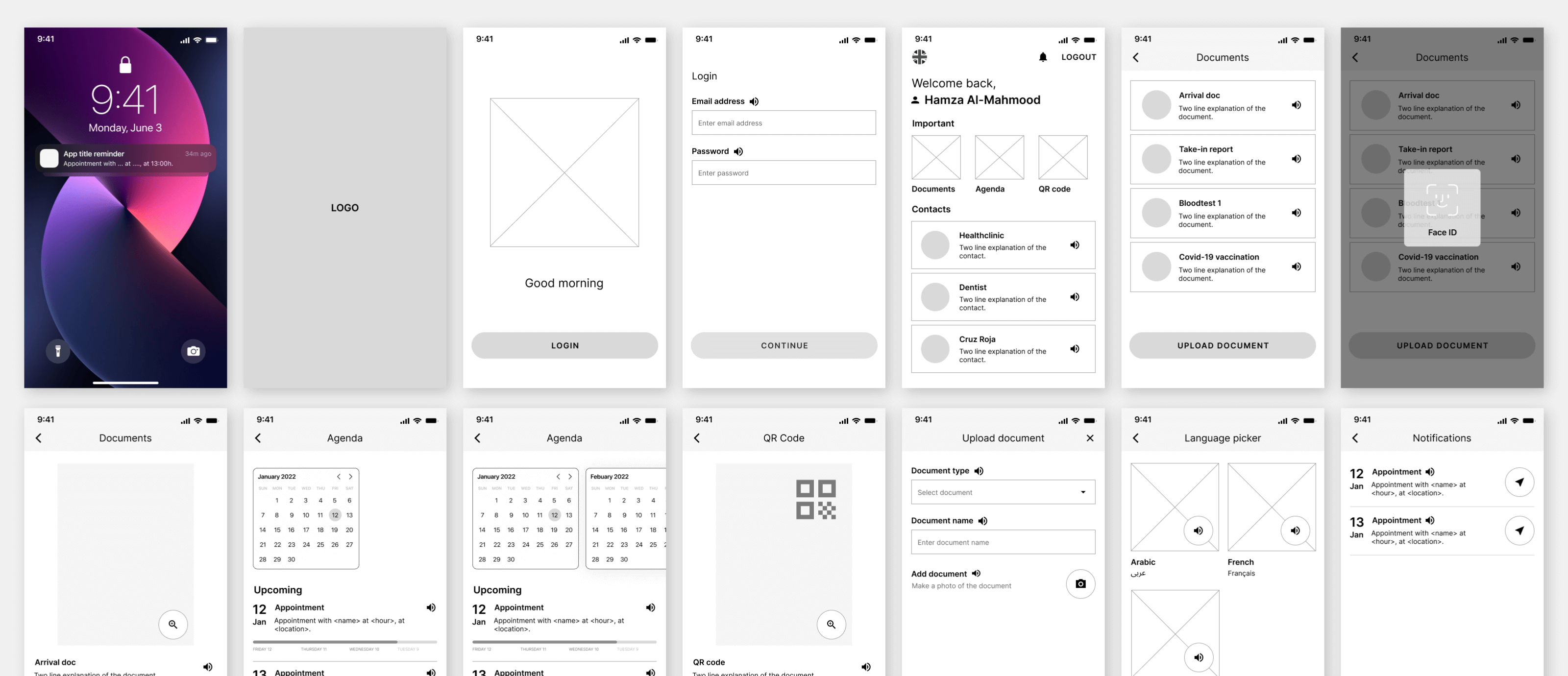
Testing
During testing it became clear that some features were redundant and/or other features were preferred. The testers had to finish tasks related to checking their agenda, uploading a new document, and finding the nearest dentist.
Face ID/Touch ID
The biggest percentage of the people who arrive at the camps don't own the newest model phones. Which meant that the security options had to be diverted to email, password, and OTP verification to guarantee safety.
Agenda
The agenda screen contained an overwhelming amount of information that would complicate the intention and actions. The solution was to simplify the design and remove certain elements to create a clean and straightforward layout.
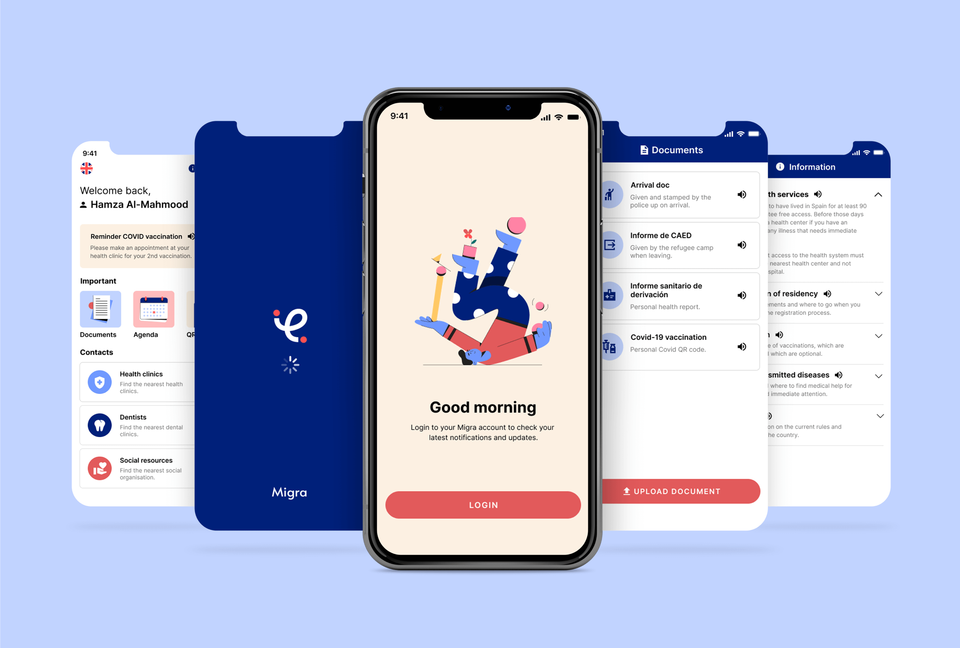
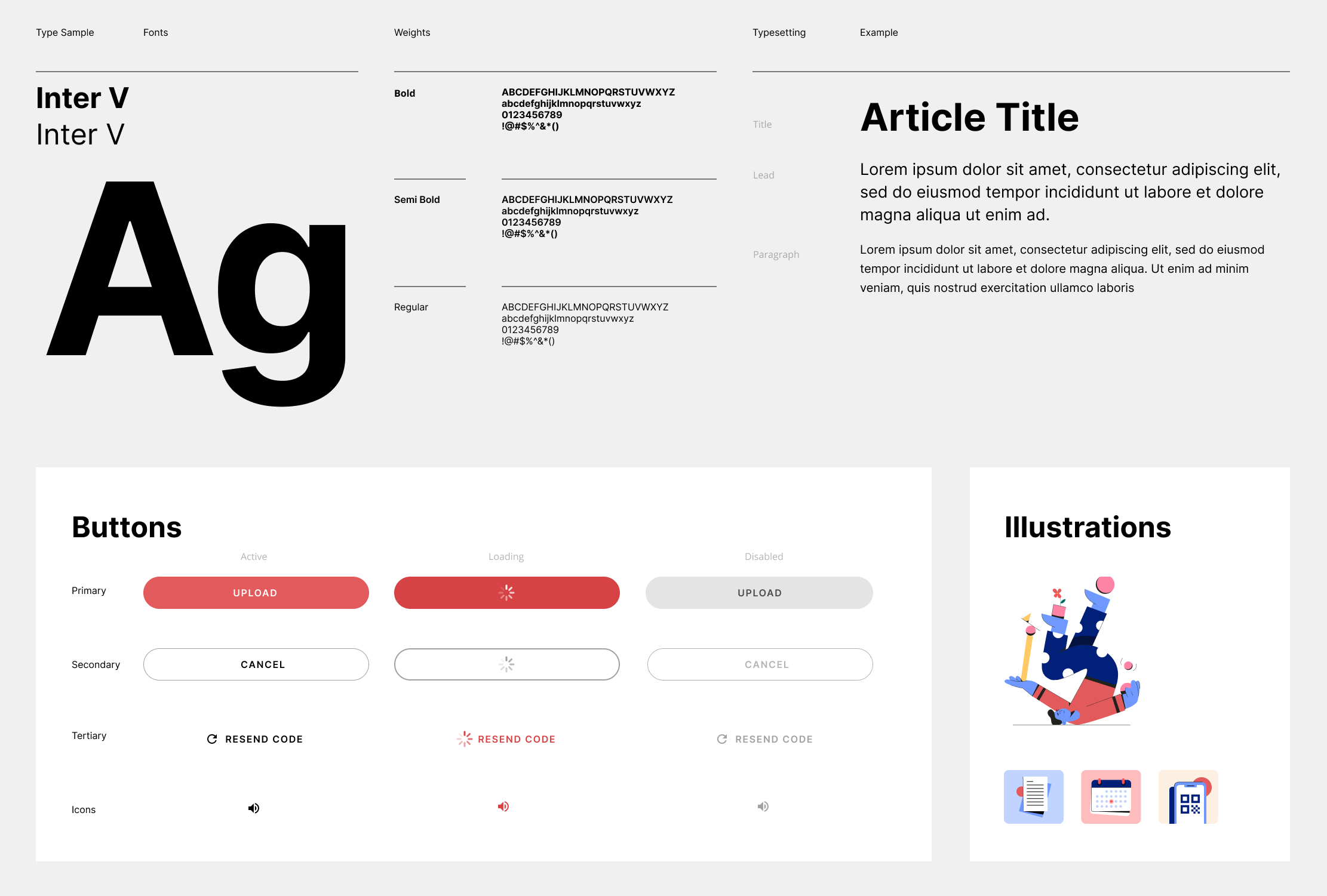
Visual identity
After the testing and refinement of the features in the app, I started to work on creating its personality. I established a design language to refine the design of the interface and maintain consistency throughout.
The goal was to create a friendly, accessible, and simple brand. Which would still look corporative but welcoming at the same time.

Learnings & takeaways
So far it has been a very interesting learning experience, I learned a lot about the current migrant situation in Spain/Europe. Which made me understand the importance of creating an app like this.
Apart from that, I learned that the interviews were of more value than I initially expected. Somehow I thought that there was more practical information online but unfortunately the arrival process isn't well documented.
As this project is still in progress, I will update this page accordingly where I will explain more about additional user testing and other changes and/or features.