Natrivu
YEAR
2022
ROLE
UX research
UX design
UI design
PRODUCT
Website
Client introduction
Natrivu is a platform that wants to help language students find the right school and destination. By using this platform the students are able to easily compare the various options and plan their language course.
Objectives
The objective is to make it easier for potential Spanish language students to find the right course abroad. This platform with help to make it easier to compare various schools within one platform. We will create an MVP to test the idea and get feedback.
Design process
Empathize:
• Interviews
• Background research
• User personas
Define:
• Feature prioritization
• MoSCow
Ideate:
• Lo-fi sketches
• User flows
Prototype:
• Prototype design
• Wireframing
Test:
• Prototype testing
• User testing
Problem statement
How might we create a Spanish language course platform to help aspiring students find the correct destination and course for them?
Project goals
To understand our target users, I conducted user interviews to gain their perspectives and validate previous hypotheses. The participants, 7 in total, were students that are currently studying Spanish at a language school, the owner of said school, and potential language students.
Goal 1 Create a MPV to test if there is interest in the language platform.
Goal 2 Help students find the right language school based on destination.
Goal 3 Make it easier for students to contact schools.
Research & Analysis
Interviews
To understand our target users, I conducted user interviews to gain their perspectives and validate previous hypotheses. The participants, 7 in total, were students that are currently studying Spanish at a language school, the owner of said school, and potential language students.
The main questions I wanted to get answers to were:
• Through which channels do students find a language school?
• What do they search for? Location, course, accreditation, etc.?
• What are their most asked questions when contacting a school?
• Why do students want to learn Spanish? What's their motivation?
Most important findings
"It wasn't easy to find the right school. I asked my Spanish teacher who told me to take a look at a website, where I had to search for the destination, which finally lead to the school website."
Mark - Language student
It is difficult to encounter the right school, this student had to (1) ask his teacher, (2) had difficulty searching the website, (3) fill in form to contact a language school.
Result: Simplifying steps by creating structure where you can directly contact the right location.
"Students search based on primarly destination, e.g. we receive more students when there are more flights from the neighbouring airports"
Yolanda - Owner language school
It became clear from multiple sources that the majority of students search for the destination first, instead of the type of course, pricing, or accreditation.
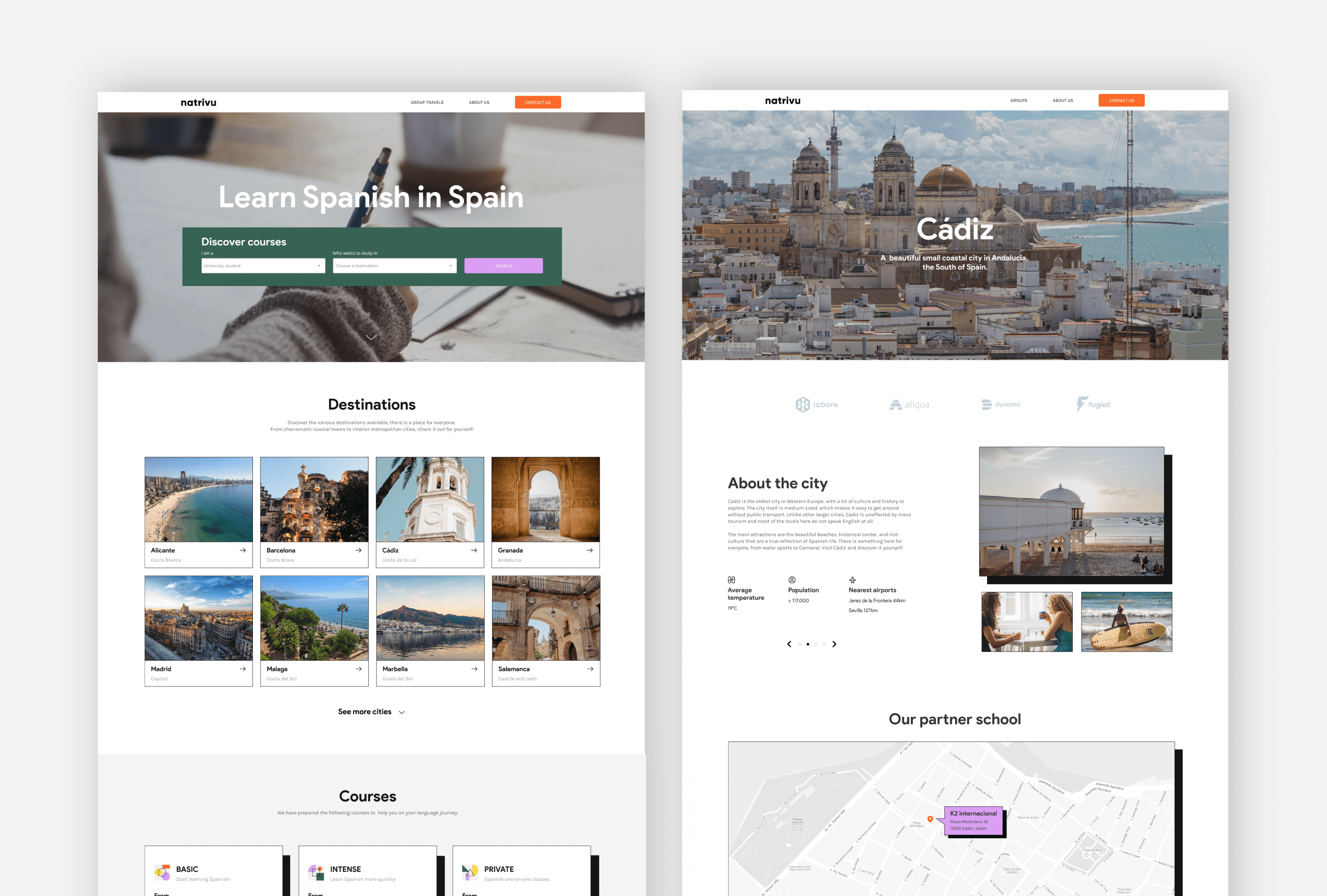
Result: Destinations are prominently displayed on the homepage.
"I don't mind going to a less known city, but I would like to learn more about it before I commit"
Mandy - Former student
Students want to know more about lesser known destinations before they book their holidays/classes. They give importancy to the city, beach, and weather.
Result: Including information about the selected location.
Personas
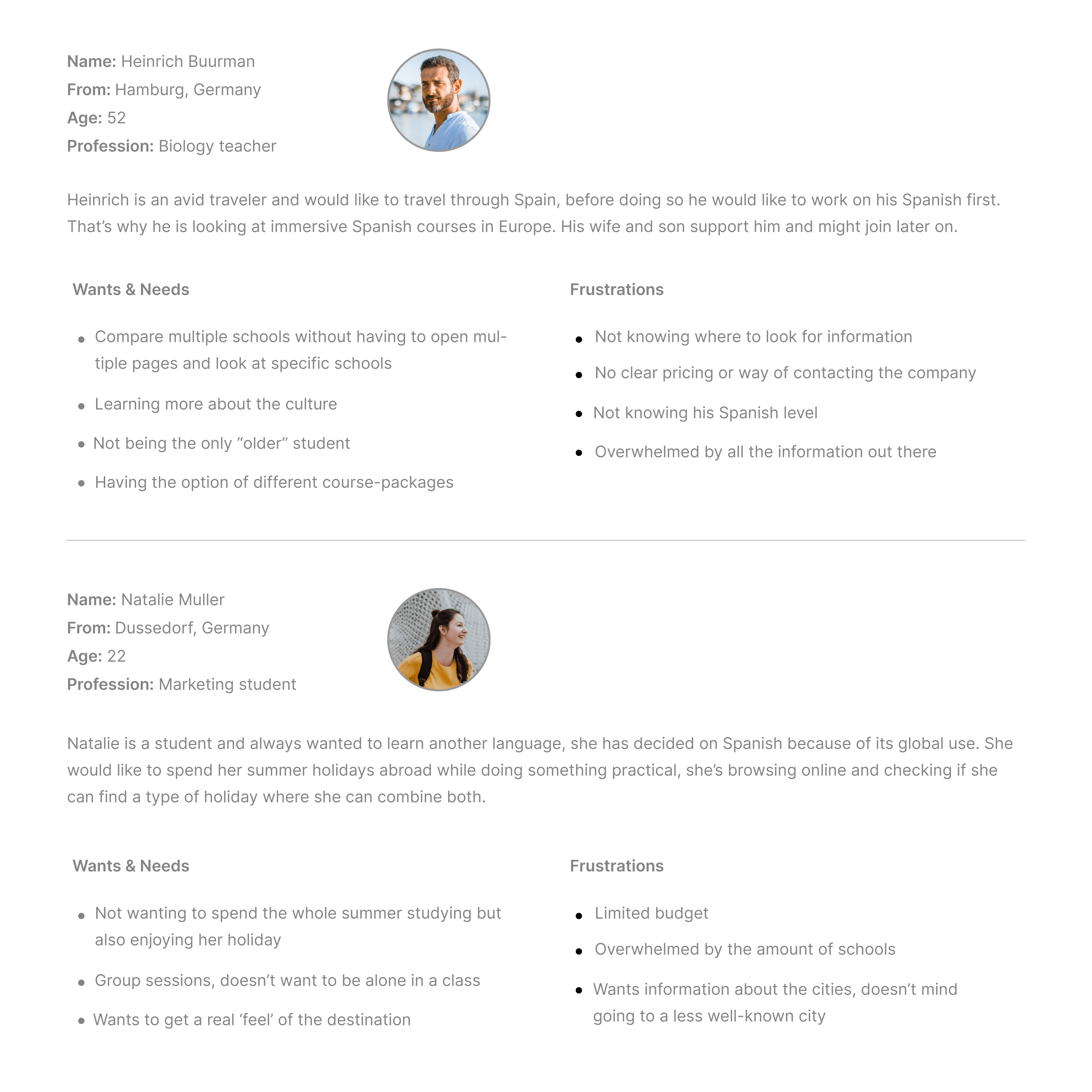
The research brought a lot interesting points to the surface, to cater to this I created 2 user profiles based on the student demographics. According to the data that I've gathered 19-25 years make up 40%, and 45-65 years make up 35% of the students that study at the local language academy. With the exception of the following numbers 25-45 years (20%) and 12-18 years (5%).
Feature prioritization
A list of features had been created based on the data collected in the previous stage. The goal of this project is to create an MVP to test if the public is interested in this platform, based on that we had to take a look at only the essential features. We used the MoSCow method to determine which functions we should include now and which functions we could implement in a later stage.

Making it visual
From sketches to wireframes
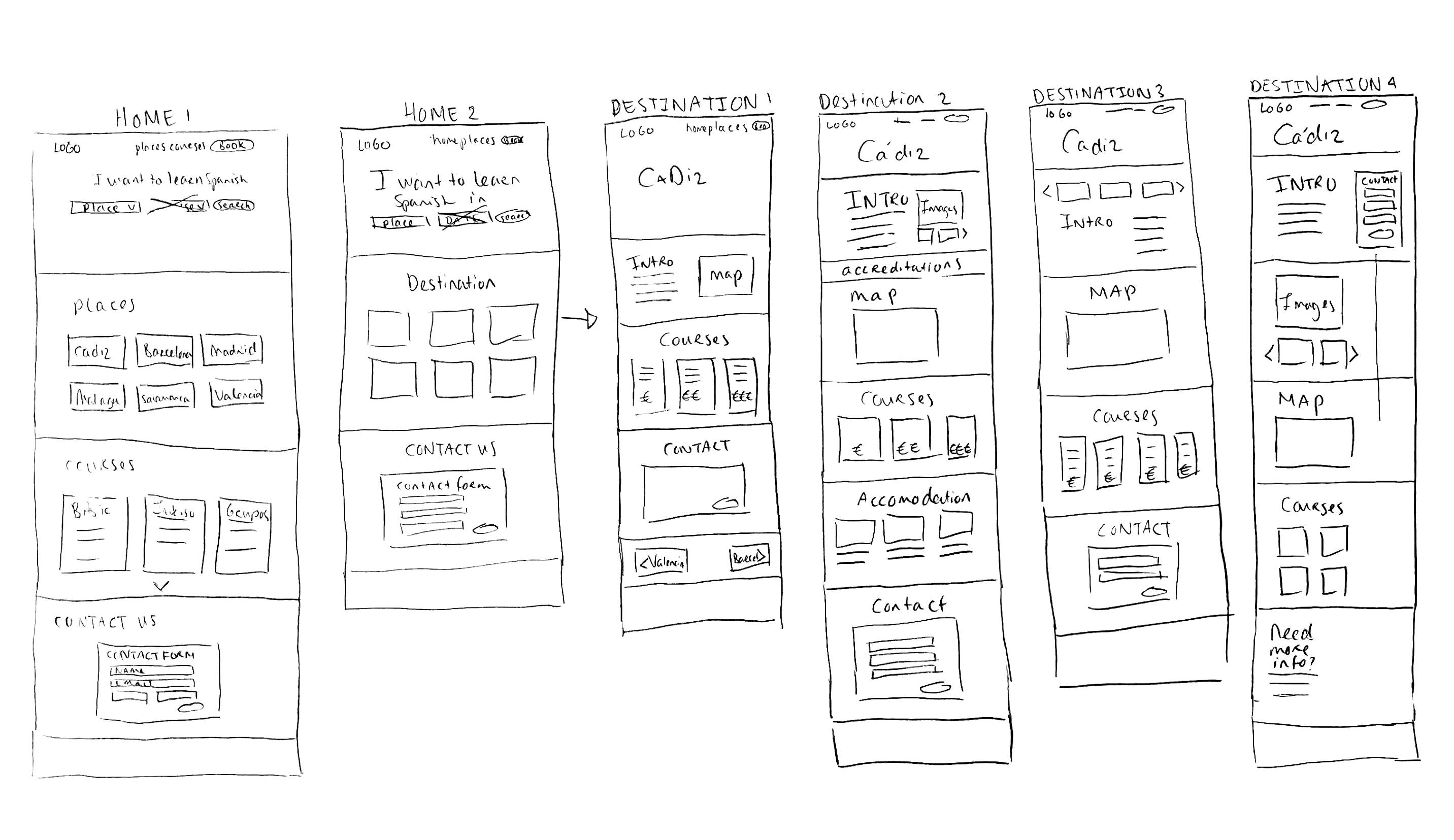
With all the features and information in mind, I started sketching and creating multiple options to further discuss with the stakeholders. This gave us the opportunity to deliberately consider where certain elements should be emphasized before going into testing.
Prototype
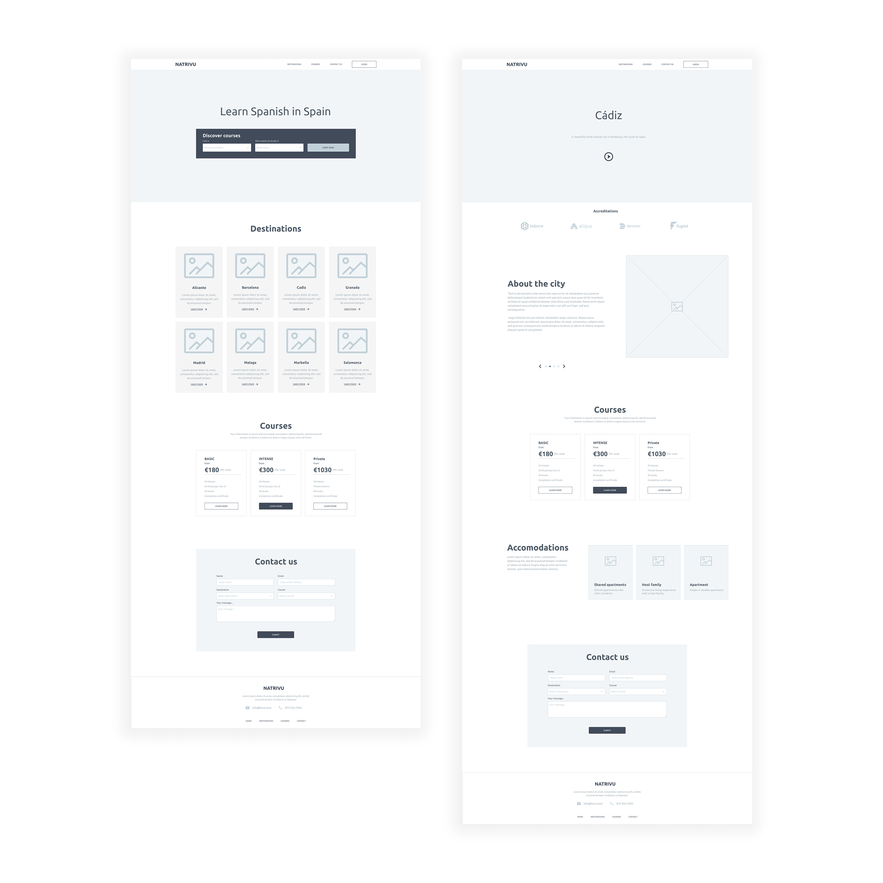
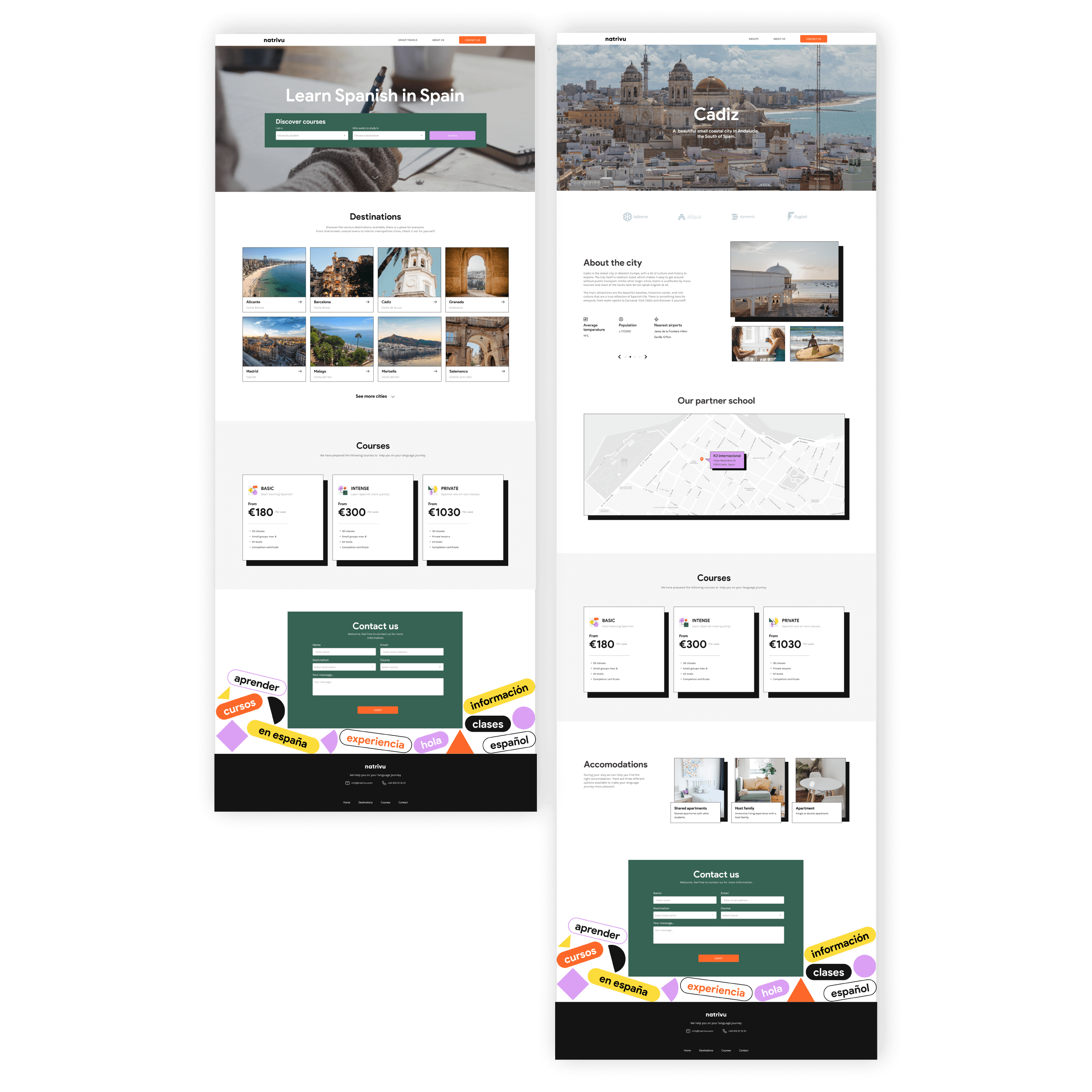
Changes have been made based on testing and discussing the wireframes. Before the location/map of the language school was removed to create a simpler design, it got reintroduced to establish a reliable brand and give more information to the client about the location. As previously done, we tried to keep the structure as simple as possible but due to business needs other pages were included, such as the About us and Groups pages.
Visual identity
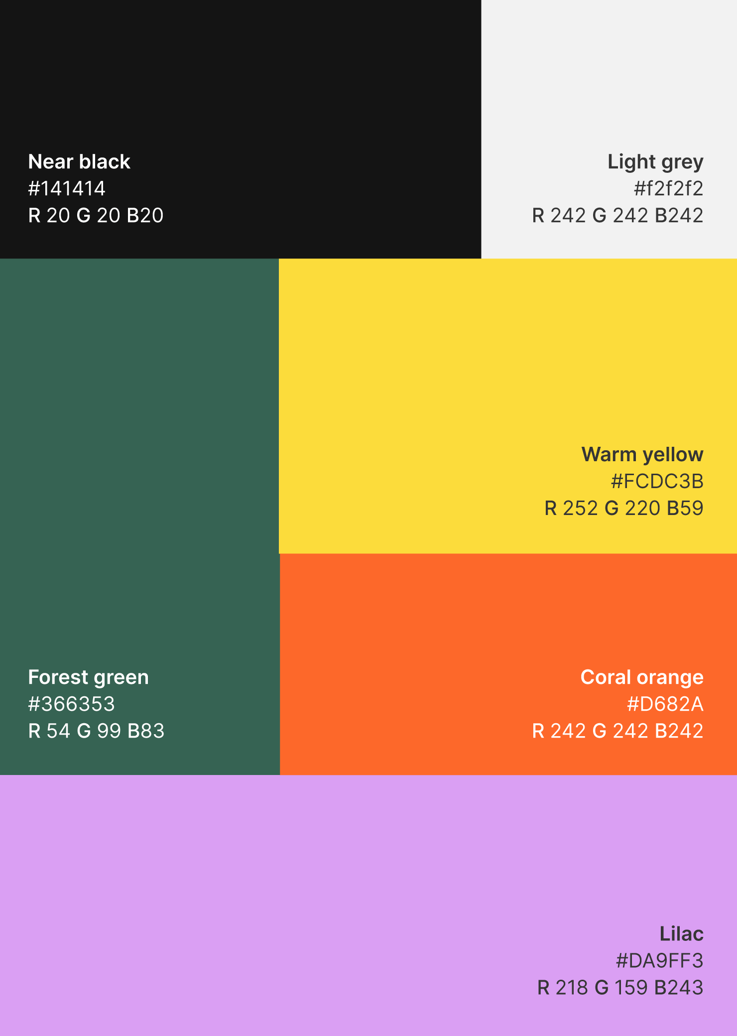
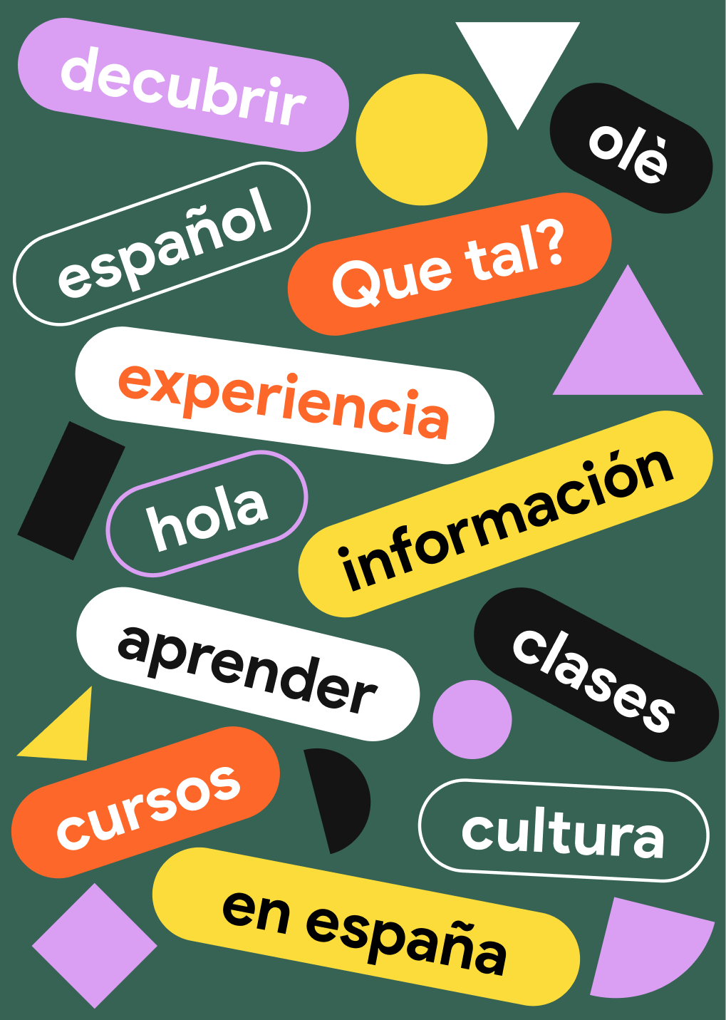
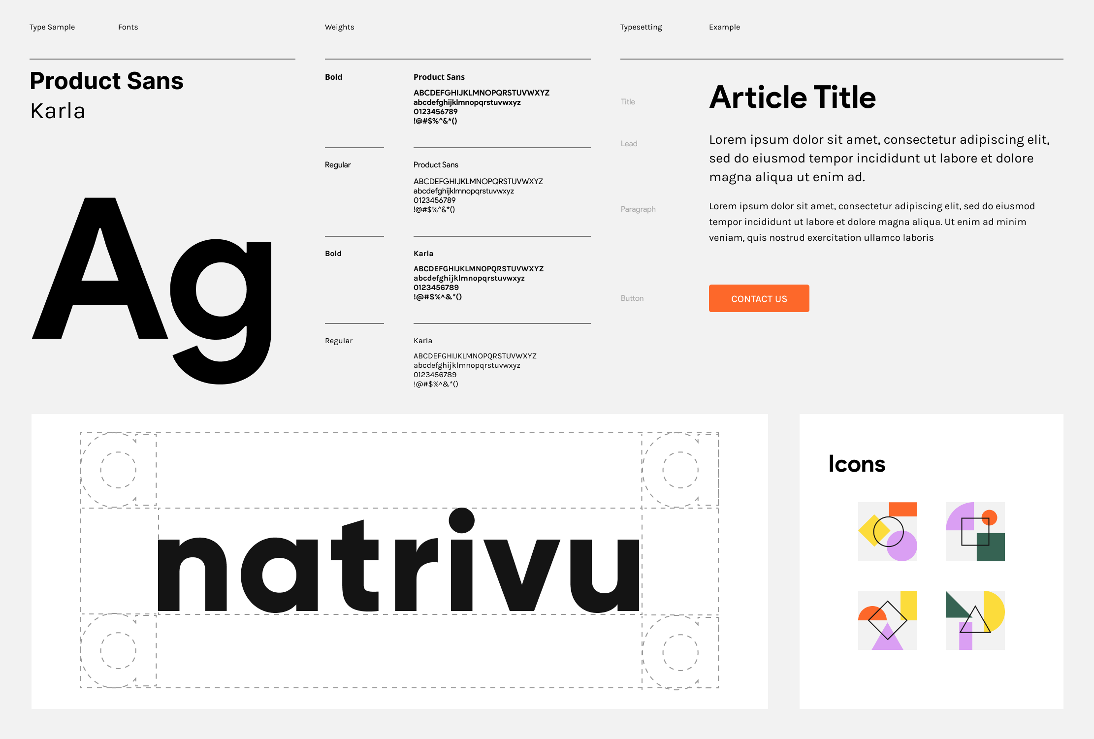
As this brand had to be created in a short period of time, we settled on a simple but clear logo that has a neutral tone to it. We are able to give the brand a bigger personality by adding a bolder colour scheme and playful elements.
The overall idea was to keep the designs simple and lively which ties in with the brands' objectives. Making information easily accessible and representing the brave journey of the students who take on this language adventure.
