Oniti
PRODUCTS
Iconography
Illustrations
STUDIO
Neosbrand
Client introduction
Oniti is a local telecommunication services provider from the South of Spain (Cádiz), that is helping people connect with each other by offering a variety of mobile plans and broadband access.


Illustrations
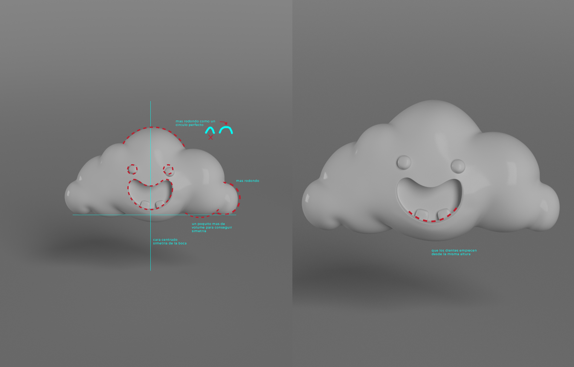
A big part of their identity relies on the colour scheme and illustrations. The 3d illustrations have been made in collaboration with Leon studio, a CG and animation studio from San Fernando, Spain.
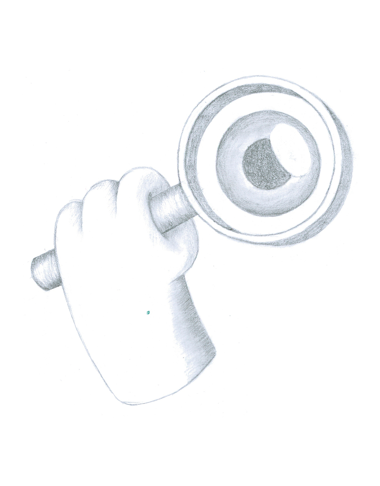
We decided to create a variety of characters to represent the different aspects/values of the brand, such as: saving money, not being bound by your plan, fast connection, and more.
My role was to create these characters, which I sketched out and passed over to the 3d team. From there on I supervised the process and made corrections where necessary.


Iconography
I had to develop their branding identity even further by adding custom icons that would serve as an extension of the brand. The result was a collection of friendly, fun, and informative icons that are used in a variety of touchpoints across web, social media, and print.

Web
We kept the brand quite simple. The founder was interested in a no-nonsense brand that would stand out among others due to its straightforward design. We played around with blocks of colours and kept the form language friendly and uncomplicated, leaning heavier into the illustrations as a way to create distinct pages.