Revamp Tarmeez app
Tarmeez Capital is a Saudi fintech making Sharia-compliant financing and investing accessible, connecting businesses and investors through digital sukuk. As the platform grew, the app started to feel behind the product. I led a revamp: reworked the navigation to make room for new products, and rebuilt the design system with AI-assisted workflows in mind.
CLIENT
Tarmeez Capital
Role
Product designer
Problem statement
How can we redesign Tarmeez's app to support new products and give investors the confidence to make their first investment?
Solution
A redesign built to scale
I restructured the navigation around what investors actually need at each stage instead of when features were built, gave the app a full visual refresh including dark mode, and rebuilt the design system so it could keep up with new products without falling behind again. The goal wasn't just a fresh coat of paint. It was a foundation that could grow with the product.

Research
Auditing the existing app
Before redesigning the navigation, I mapped out everything currently in the app: every screen, every feature, and how someone would actually get to it. This surfaced how much had been added over time without a clear home, and made it obvious where the structure was breaking down.
A few things stood out right away:
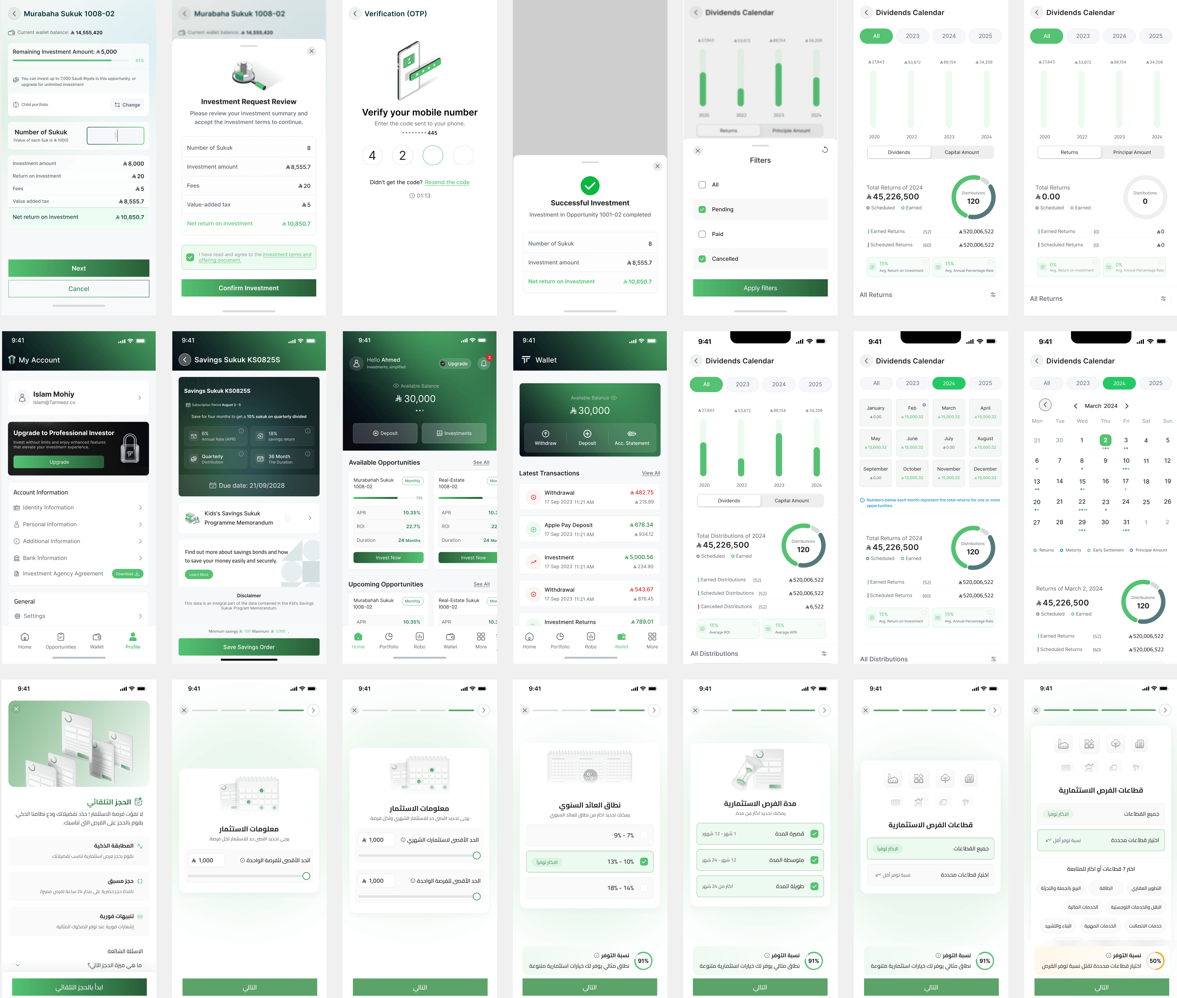
Home screen and bottom navigation had no room to grow. New items had nowhere to go, some screens were tucked further away than they should be, and Home and Opportunities were showing the same information twice.
The visual style needed updating. Heavy use of green caused problems when something wasn't meant to read as positive, components hadn't kept pace with the product, and none of it was set up to work well with AI-assisted workflows going forward.
Analytics
Before making changes, I dug into the analytics to see how people were actually using the app. A few things stood out:
Finding 1
Investment Wallet (similar to portfolio) is the 2nd most visited page, but it's buried in the navigation.
Finding 2
Opportunities is only the 8th most visited page, yet it's one of the easiest to reach.
Finding 3
54% of the people are more interested in upcoming Investment Opportunities vs existing.
Together, these told me the nav was optimized for the wrong things. What people actually used most wasn't easy to reach, and what was easy to reach wasn't what they cared about most.
Homepage
The audit and the analytics pointed to the same page. Special offerings were easy to miss, cards looked too similar to tell apart at a glance, there was no way to promote a new product, and the top section felt visually outdated next to what investors expect from a modern investment app.

Explorations
With the audit done, I started exploring what a rebuilt homepage could look like. Early versions tried showing total net worth, cash versus invested breakdowns, action items, and recent activity all at once. Some leaned more like a dashboard, others leaned more like a wallet.
Testing these against what the analytics told us, the wallet-first direction won out. It surfaced the numbers investors check most often (total balance, active investments, recent activity) without making them dig for it, and it left room for the "action items" pattern (accept terms, confirm reservation, schedule a call) to guide people who hadn't finished onboarding yet.
Where I landed: a homepage built around total balance and current opportunities up top, with sectors, transactions, and FAQs available but out of the way until someone wants them.

Solution
The new homepage
The homepage leads with total balance and a deposit action, then moves into opportunities. Each card shows more at a glance (ROI, APR, duration, distribution, and tags like Zakat free) so cards no longer look interchangeable. A banner slot makes it possible to promote offers like Premium upgrades, something the old homepage had no room for.
Navigation Rework
With the full picture, I grouped features by what investors needed at each stage, not by when they were built. Some sections merged, some features moved out of the main nav, and a few three-tap actions became one.

In the old nav, Home and Opportunities showed almost the same content, so investors were seeing the same information twice. Wallet also took up a full tab of its own, even though most people cared more about seeing a breakdown of their actual investments.

Option 1:
Opportunities will be renamed to Sukuk to better represent the Investment type
Robo advisory is a new Investment product that would need it’s own tab
Account is removed from view and replaced with more, where multiple features can live

Option 2:
Wallet could be the main view, similar to banking apps.
Invest could hold both the Sukuk Opportunities and other investment products
Portfolio would show all investments
Where I landed: Investors open the app to check their money first, not to browse products, so putting Wallet front and center matched how people were actually using the app based on the analytics. Folding Robo Advisory into Invest also meant we didn't need a sixth tab for a product that's still early.
Dark mode
I built the color system so light and dark mode share the same values, not two separate designs. Colours are named by function (like tm-fill or tm-key), not appearance, so a token means the same thing no matter which mode it renders in, and switching modes just works with no mismatches.

Interaction design
Redesigning the navigation was only half the job. I wanted the app to feel considered in how it responded to touch, not just organized. I focused on moments where motion could reduce friction or add reassurance.
Keeping the balance in view
The balance stays pinned to the top of the home screen. As you scroll through opportunities, you always know what you have available to invest.
Graph animations
To give the app a more premium feel, charts animate in as you scroll instead of sitting static, adding life and encouraging you to keep going.
Introducing features
The onboarding screens explain what each section does, and the animations give the whole thing a more polished feel.
AI assisted workflow
Skills + .MD file + Ideation + Brainstorming
AI became part of how I worked throughout this project, not just a tool I reached for occasionally. I set up custom skills and a project .MD file so Claude had the context it needed about the design system, the product, and how Tarmeez works, instead of starting from scratch every time. That made it useful for ideation too. When I was stuck on how to restructure the navigation or needed to pressure test an idea before bringing it to the team, I could talk it through and get pushback, not just agreement. It sped up the early messy part of the process, where you're throwing out ideas to see what sticks.
Designing with the codebase, not just for it
A design system was already set in place to streamline the design process and ensure brand integrity. While the majority of components were already created, it was nonetheless necessary to create new items and variants for the newer sections within the portal and improve upon the existing ones.
Exploring Widgetbook
Alongside that, I worked with the dev team to explore adopting Widgetbook, and built out Figma documentation to support it. The goal was a shared source of truth that didn't rely on someone remembering to update a spec doc.
Linking tokens to code
One focus area throughout the project was connecting Figma tokens directly to the codebase, so a change to a color or spacing value could move through the system without redoing it by hand in multiple places. This mattered even more with dark mode in the mix, since it doubled the number of values that needed to stay consistent.
What's next?
Conclusion
This case study covers the redesign up to launch. Once the app is live, I'm curious to see whether Portfolio actually gives investors the breakdown the analytics said they needed. I'll be updating this case study with real usage data after release.